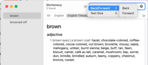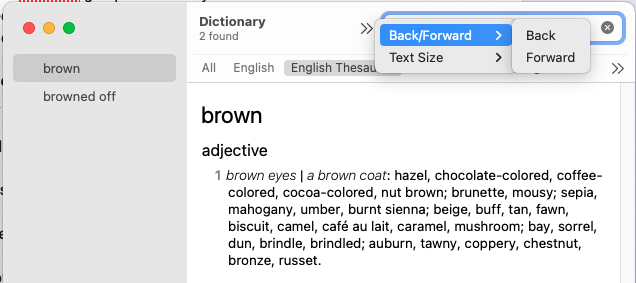
Here’s a new, “improved” design for Apple’s built-in Dictionary app. Now, instead of clicking a back arrow to go back to the previous screen (a very useful feature when trying to choose just the right word), you click what looks like a forward arrow, and then you choose Back/Forward from the drop-down menu, and then you choose Back from the Back and Forward sub-menu. An intuitive one-click action has been replaced by a non-intuitive (go forward to go back) POS interface, thanks. Hope it fits better in your ridiculous quest to fit the entire spectrum of online activity into a fucking phone. Remember, Einstein said to make things as simple as possible and no simpler. These squads of people have to justify their jobs, I guess, by constantly reinventing things to make them worse. And the apps are designed by committees. Lots of people trained in specialties with no idea of the whole and no meta-views going on.

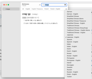
So now, when I want a dictionary of the English language, its interface is irritating to use in order that it can accommodate access to dictionaries of every other language. No. Nope. No.


